

Web design never sits still. What worked yesterday can look dated tomorrow, making it crucial to keep your finger on the pulse of layouts web trends if you want to stay ahead in 2026.
The Importance of Web Layouts in 2026
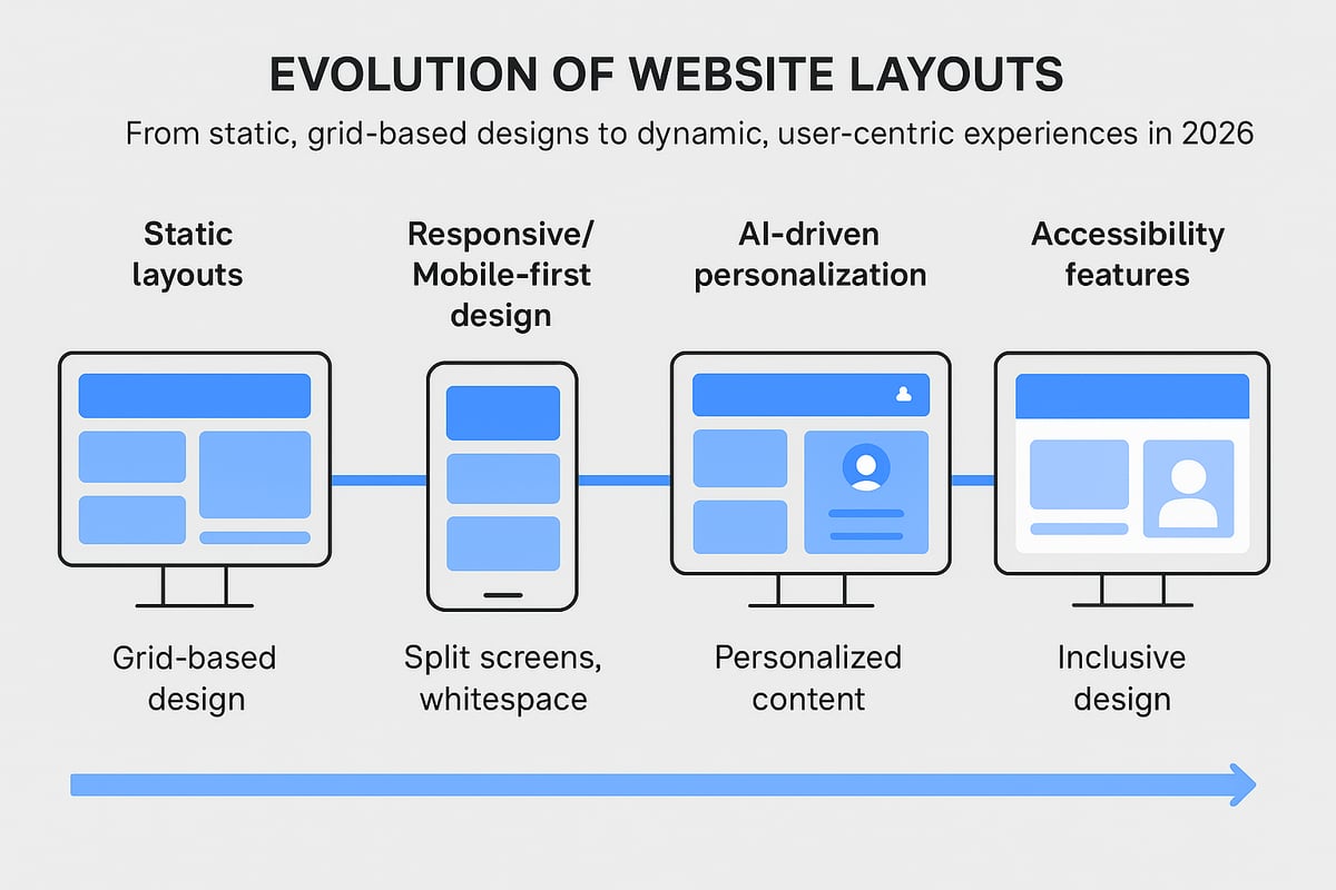
The Evolution of Website Layouts
Modern layouts web guide users smoothly from landing to conversion. Brands like Apple and Airbnb thrive because their layouts anticipate user needs, keep journeys intuitive, and build trust at every step. Web design influences 94% of first impressions.
Key Criteria for Effective Layouts
- Clear navigation at the top or side
- Logical flow of content blocks
- Strategic use of whitespace for breathing room
- Consistent alignment and spacing
- Adaptive elements for different screen sizes
How to Choose the Right Layout Trend
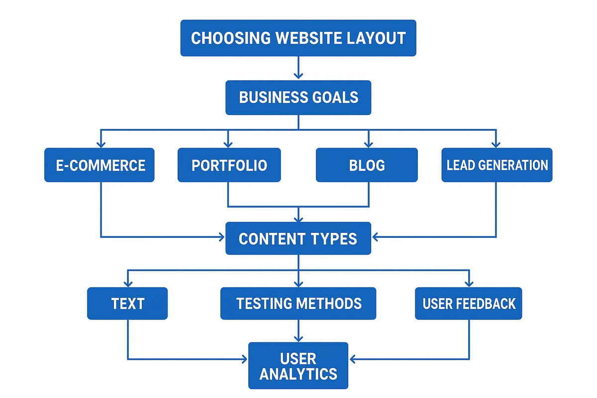
| Industry | Ideal Layouts Web |
|---|---|
| E-commerce | Grid, card-based |
| Portfolio | Split-screen, fullscreen |
| Blog/News | Modular, magazine-style |
| SaaS/Service | Z-pattern, minimalism |
7 Inspiring Layouts Web Trends to Try in 2026
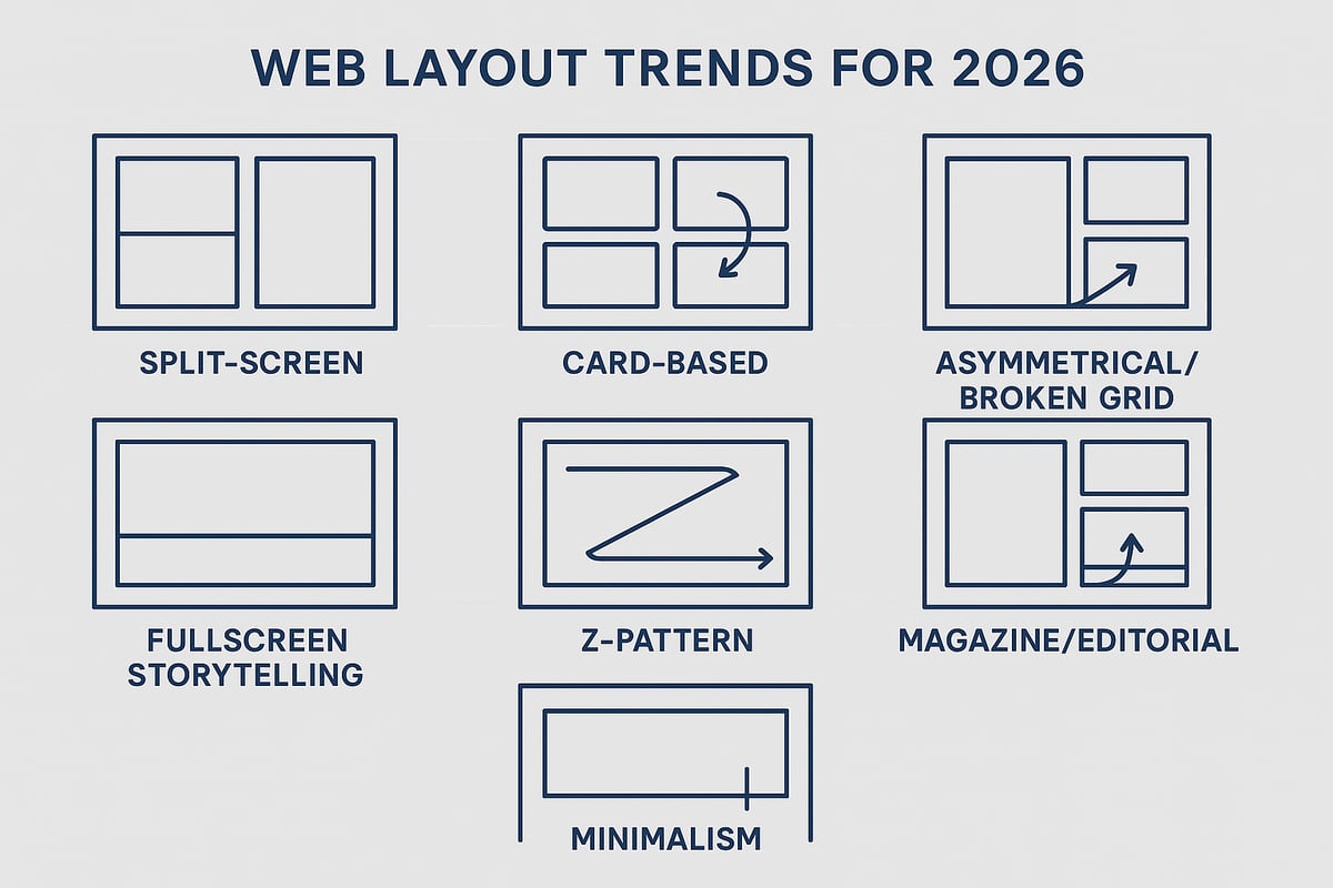
1. Immersive Split-Screen Experiences
Split-screen layouts increased user interaction by up to 20%. Use bold colour contrast, interactive transitions, and accessibility-first navigation.
2. Dynamic Card-Based Layouts
| Feature | Benefit | Challenge |
|---|---|---|
| Modular blocks | Easy updates | Can look generic |
| Mobile-friendly | Reaches more users | Needs careful spacing |
| Personalisation | Higher engagement | Data/privacy |
3. Asymmetrical & Broken Grid Layouts
- Pair bold visuals with subtle text to avoid clutter
- Use a strong underlying grid as an anchor
- Test across browsers for consistency
- Prioritise content hierarchy for usability
4. Fullscreen Visual Storytelling
- Layer text and calls to action over images for clarity
- Use subtle navigation cues to guide users
- Optimise media for fast loading, especially on mobile
- Test contrast and font size for accessibility
5. Adaptive Z-Pattern & F-Pattern Layouts
.grid-container {
  display: grid;
  grid-template-areas:
    "logo nav"
    "main cta";
}
6. Modular Magazine & Editorial Layouts
- Flexible sections for varied content types
- Enhanced visual storytelling
- Easy integration of interactive features
7. Minimalism with Purposeful Whitespace
- Emphasise whitespace to separate key elements
- Use bold, legible fonts for clarity
- Highlight calls to action with colour or contrast
Accessibility, Performance, and SEO Considerations
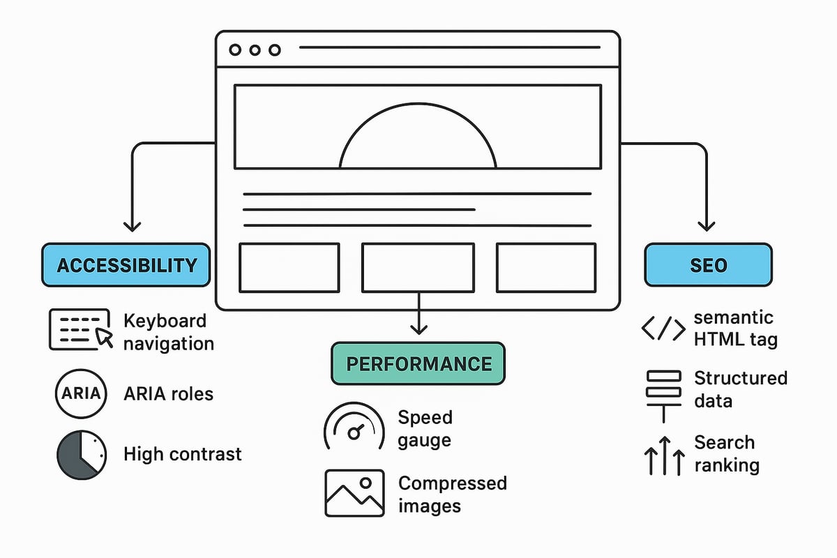
Accessibility Best Practices
- Keyboard navigation for users who can't use a mouse
- ARIA roles to improve screen reader support
- High contrast ratios for readability
Performance Optimisation
| Optimisation | Load Time Before | Load Time After |
|---|---|---|
| Image Compression | 4.2s | 2.1s |
| Code Splitting | 3.5s | 1.8s |
Future-Proofing Your Website Layout
Schedule annual layout reviews. Invest in user testing and feedback loops. Use prototyping tools for rapid experimentation. Collect both quantitative and qualitative data.
If you're ready to bring these 2026 layout trends to life and want your website working harder, Marketing XP can help you avoid costly mistakes and turn visitors into real customers.