
In 2026, the pace of digital change is relentless. What was once considered good ui design is now just the starting point. Today, creating digital products means delivering seamless, accessible, and genuinely delightful experiences for every user.
This guide is here to equip designers, developers, and product teams with practical insights for mastering ui design in a world shaped by new technology and rising expectations. You'll find a clear framework that covers the latest principles, must-know trends, and actionable steps to future-proof your interfaces.
Ready to discover how to create intuitive, inclusive, and engaging designs? Dive in and learn the strategies you need to stay ahead and deliver products people love.
Understanding UI Design in 2026
UI design is evolving rapidly, shaped by new devices, user behaviours, and expectations. In 2026, ui design is about more than just pretty visuals; it’s the core of how people interact with digital products. Staying ahead means understanding the principles, types, and impact of modern ui design, and how it underpins product success. For a deeper dive into current trends and strategies, you can explore Web design insights and trends.

Defining UI Design: Beyond Visuals
UI design is the craft of building interactive digital interfaces that users engage with every day. It’s not just about how things look, but how they work and feel. Don Norman describes ui design as the sum of all visual and interactive elements that shape a user’s perception and satisfaction.
Think about the buttons, icons, layouts, and subtle animations you see on your phone, watch, or even in AR glasses. These details drive usability and emotional connection. Users form their first impressions of a product’s ui design within seconds, making it crucial across all devices, from desktops to wearables and immersive AR/VR platforms. The right design choices can make or break the user’s experience.
Types of User Interfaces in 2026
In 2026, ui design covers a wide range of interfaces. The classic graphical user interface (GUI) is joined by voice user interfaces (VUIs) and gesture-based controls. AR/VR and mixed reality UIs are becoming mainstream. For example, smartphone GUIs, Alexa and Siri for VUIs, and VR hand controllers for gaming all rely on ui design to guide users.
Here’s a quick comparison:
| UI Type | Example Device | Key Feature |
|---|---|---|
| GUI | Smartphone, PC | Visual navigation |
| VUI | Smart speaker | Voice commands |
| Gesture | VR headset | Motion control |
| AR/VR | Mixed reality | Spatial interaction |
Multi-modal interfaces, blending voice, touch, and gestures, make digital products more accessible and engaging. AI-driven conversational UIs are also on the rise, adapting to user needs in real time.
The Role of UI in Product Success
UI design plays a critical role in whether users adopt and stick with digital products. It’s the first impression, the handshake between brand and user. A well-crafted ui design communicates brand values, builds trust, and encourages users to take action.
Take Airbnb’s clean layout or Domino’s Zero Click app, where the interface makes task completion effortless. Data shows users prefer interfaces that are easy, fast, and enjoyable. UI design also drives accessibility and inclusion, helping everyone connect emotionally with your product.
UI vs. UX: Collaboration, Not Competition
There’s often confusion between ui design and user experience (UX), but they work hand in hand. UX is the journey, the big picture of how users feel and flow through a product. UI design brings that journey to life with tangible touchpoints, like buttons, forms, and feedback animations.
Collaboration between UI and UX teams leads to seamless products. For example, UX might map the user’s journey, while ui design shapes each interaction. Roles should be based on strengths, not job titles. This partnership ensures the entire user journey feels cohesive and satisfying.
Key Elements of Modern UI Design
Modern ui design relies on a few core elements:
- Input controls: buttons, dropdowns, toggles
- Informational components: notifications, progress bars
- Navigation elements: menus, tabs, breadcrumbs
Consistency, clarity, and feedback are essential. Google’s Material Design sets the bar for clear and consistent ui design, ensuring users always know what to do next.
Core Principles of Effective UI Design
Mastering ui design in 2026 means going beyond what looks good. It’s about making interfaces that users can trust, understand, and enjoy. Let’s break down the core principles every designer needs to future-proof their work.

Clarity and Simplicity
Clarity is the backbone of ui design. If users can’t figure out what to do next, they’ll leave. Make every action obvious. Use straightforward labels, easy-to-recognise icons, and strip away anything that doesn’t serve a purpose.
- Use large, readable typography for important information.
- Stick to a simple colour palette to reduce visual noise.
- Limit choices on each screen to avoid overwhelming users.
Research shows people focus on getting things done, not deciphering complex interfaces. The best ui design makes the path from start to finish clear and free of clutter. Always ask: can a new user figure this out in seconds?
Consistency and Visual Hierarchy
Consistency builds trust in ui design. When buttons, fonts, and colours behave the same way across screens, users learn faster and feel more confident. Rely on design systems and style guides, such as Material Design or iOS Human Interface Guidelines, to keep things uniform.
- Repeat spacing, colours, and icon styles throughout.
- Use size and colour to highlight what matters most.
- Align elements so the user’s eye flows naturally.
A strong visual hierarchy means users know where to look next. Think of Airbnb’s consistent use of white space and accent colours—users never get lost. Consistency lowers the learning curve and creates a seamless experience.
Feedback and Responsiveness
Effective ui design always shows users what’s happening. Every tap, click, or swipe should get a response. Immediate feedback—like button highlights, loading spinners, or error messages—helps users feel in control.
- Animate transitions for smoother navigation.
- Use micro-interactions for small, delightful responses.
- Always confirm successful actions or flag errors clearly.
Responsive interfaces keep frustration low and engagement high. For more strategies on how feedback can boost usability and conversion, check out these Website optimisation strategies. When users know their actions matter, they stick around.
Accessibility and Inclusivity
Great ui design includes everyone. Design for users with all abilities—visual, motor, cognitive, and hearing. High contrast, scalable fonts, and clear navigation are essential.
- Test colour contrast and use readable font sizes.
- Support keyboard-only navigation and screen readers.
- Add alternative text to images and use ARIA labels.
Reference accessibility guidelines, like those from Material Design. Airbnb’s accessible booking flows show how thoughtful design can welcome more users. Accessibility is not just a legal box to tick—it’s an opportunity for innovation and broader reach.
Affordances and Discoverability
Every interactive element in ui design should look and feel clickable, tappable, or swipeable. Affordances are visual cues that tell users what’s possible, reducing guesswork.
- Use raised buttons, shadows, or hover effects for clickable items.
- Make icons clear and descriptive.
- Group related actions visually to guide discovery.
When users instantly know what they can do, they complete tasks faster. Data shows clear affordances directly improve completion rates. Don’t leave users guessing—make every action obvious.
Emotional Design and Delight
Ui design isn’t just functional—it can spark positive emotions. Thoughtful touches like animations, illustrations, and playful microcopy make experiences memorable.
- Add delightful success messages or playful empty states.
- Use animation to reinforce brand personality.
- Tell a story visually to connect with users.
Emotional design builds loyalty and keeps users coming back. A little delight goes a long way in separating a good interface from a great one.
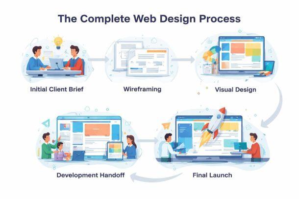
Step-by-Step Guide to Designing a Modern UI
Designing a successful ui design in 2026 is more strategic than ever. The process is less about guesswork and more about understanding users, testing ideas, and collaborating across teams. Here’s a step-by-step guide to get your ui design ready for the future.

Step 1: Research and Understand User Needs
A great ui design starts with deep user understanding. Begin by conducting interviews, surveys, and analysing analytics to uncover what users truly want.
Build out personas that reflect the diversity of your audience. Map their journeys and pain points using customer journey maps. This will reveal insights into how your ui design can simplify their tasks.
For example, reviewing the checkout flow on an ecommerce site can highlight barriers that slow users down. By focusing on specific needs and frustrations, your ui design becomes more targeted and effective.
Step 2: Define Information Architecture and User Flows
Next, structure your content and features logically. A robust ui design depends on a well-organised sitemap and clear user flows.
Use flowcharts and wireframes to visualise how users navigate. Prioritise essential tasks, cutting out anything that creates friction. For instance, mobile banking apps often focus on streamlining navigation so users can complete tasks quickly.
Align every flow in your ui design with both user goals and business objectives. This clarity reduces confusion and boosts engagement.
Step 3: Design Wireframes and Prototypes
With architecture in place, sketch out low-fidelity wireframes. These help plan the layout and hierarchy of your ui design without getting bogged down by visuals.
Collaborate early and often. Tools like Figma and Sketch enable quick feedback, so you can refine before moving to high-fidelity prototypes. Interactive prototypes bring your ui design to life, letting you test transitions and interactions.
Rapid prototyping means issues are spotted early, saving both time and money while keeping your team aligned.
Step 4: Apply Visual Design Principles
Now it’s time to make your ui design visually appealing and accessible. Choose colour palettes that reflect your brand and ensure high contrast for readability.
Pick fonts that are easy to read and size them appropriately. Icons should be clear and meaningful. Develop a style guide to keep your ui design consistent across screens.
Material Design is a great reference for bold colours and large typography. Always check contrast ratios and spacing to make sure everyone can use your ui design comfortably.
Step 5: Implement and Test Responsiveness
Modern users expect your ui design to work perfectly on any device. Start with a mobile-first approach and expand layouts for larger screens.
Test your ui design on desktops, tablets, mobiles, and even AR or VR devices if relevant. Use adaptive navigation menus to keep things simple on smaller screens.
Tools like BrowserStack or in-browser developer tools can help you spot layout issues early. Responsive ui design ensures users have a smooth experience, no matter where they are.
Step 6: Conduct Usability Testing and Iterate
Usability testing is where your ui design meets reality. Run tests with real users, observing how they interact and where they struggle.
Gather feedback and usage data to identify pain points. Make incremental improvements based on evidence, not assumptions. Techniques like A/B testing allow you to compare different button placements or colour schemes.
For those aiming to boost engagement and conversions, reviewing Conversion rate optimisation tips can provide valuable strategies to refine your ui design further.
Step 7: Handoff and Collaboration with Developers
The final step is seamless collaboration. Prepare clear design assets, specifications, and documentation so developers can bring your ui design to life accurately.
Use shared libraries and design systems to maintain consistency. Figma’s Dev Mode, for example, streamlines the handoff process by translating designs into code-friendly formats.
Keep communication open throughout. Regular check-ins ensure your ui design remains true to your vision and adapts smoothly from design to deployment.
Emerging Trends and Technologies in UI Design
The world of ui design is transforming faster than ever, shaped by new tech, changing user needs, and an expectation for seamless experiences. Staying ahead means understanding the trends redefining how people interact with digital products.

AI and Personalisation in UI
AI is changing the face of ui design, making interfaces smarter and more responsive to individual users. Adaptive layouts, predictive suggestions, and content tailored to behaviour are now commonplace. For instance, Netflix’s recommendation UI is a prime example of how machine learning adapts to user preferences in real time.
Personalised ui design increases engagement but brings challenges like privacy and maintaining user trust. Transparency and user control are key. According to recent studies, users are more satisfied with interfaces that feel tailored to them. For an in-depth look at these innovations, check out AI-driven UI design trends.
Voice, Gesture, and Multi-Modal Interfaces
The evolution of ui design now includes voice user interfaces (VUIs), gesture controls, and multi-modal experiences. Devices like Alexa and Google Home have made voice commands a daily habit for millions. Gesture-based controls are also on the rise, especially in AR/VR environments and smart home tech.
Multi-modal ui design improves accessibility and engagement by letting users interact in ways that suit them best. Data shows a steady increase in adoption rates for both voice and gesture interfaces, making them essential for future-ready products.
Micro-Interactions and Motion Design
Micro-interactions are the tiny animations and feedback cues that bring ui design to life. Think of liking a post, swiping to delete, or watching an animated loading spinner. These small touches enhance usability, guide attention, and make interfaces more enjoyable.
Motion design helps users understand what’s happening, providing visual feedback and reinforcing hierarchy. A well-placed animation can make a task feel effortless and even delightful. The best ui design uses micro-interactions not just for flair, but to improve clarity and flow.
Dark Mode, Colour Trends, and Visual Innovation
Dark mode is no longer a gimmick but a standard expectation in ui design. Custom themes, bold colour palettes, and gradients are also trending, allowing users to personalise their experience. Material Design’s focus on high contrast and clarity has set a benchmark for accessible visuals.
Designers are experimenting with styles like neumorphism and glassmorphism, balancing innovation with usability. The challenge is to keep interfaces not just beautiful but also accessible to everyone. Staying on top of colour and visual trends helps products feel modern and inclusive.
Future-Proofing UI for New Devices and Contexts
The landscape of ui design is expanding beyond traditional screens. Designers now account for wearables, foldables, and immersive devices like AR headsets and smartwatches. Each new device category brings unique challenges and opportunities.
Adaptability is crucial. A ui design that works on a smartwatch must be simple and glanceable, while AR interfaces require spatial awareness. Market projections show rapid growth in these areas, so future-proofing your design approach is more important than ever.
Best Practices and Expert Tips for UI Designers in 2026
The pace of change in ui design is relentless, and only those who adopt best practices will thrive. Let's break down the key strategies every designer should master in 2026 to ensure their interfaces not only look good but deliver measurable results.
Prioritising Usability and Task Completion
At the heart of ui design lies usability. Users want to finish tasks quickly, without obstacles. Focus on creating “invisible” interfaces that let users accomplish their goals with minimal effort.
Consider Domino’s Zero Click app, where a pizza is ordered with a single tap. This approach strips away friction, making the ui design almost disappear. Research consistently shows that when the interface gets out of the way, conversion and retention rates climb.
- Use clear calls to action
- Reduce steps in key flows
- Make feedback immediate
Remember, users judge your ui design by how easy it makes their lives, not how flashy it looks.
Leveraging Design Systems and Guidelines
Consistency is non-negotiable in ui design. Relying on design systems like Material Design or Apple’s Human Interface Guidelines ensures that every element feels familiar and predictable.
Design systems speed up development, boost scalability, and make maintenance far easier. They also help teams avoid reinventing the wheel on every project. For even greater impact, tailor your system to reflect your brand’s unique voice and needs.
- Adopt or customise a design system
- Document components and usage rules
- Keep systems updated as the product evolves
Explore strategies for future-proofing your digital experiences in the Digital strategy for modern websites category, which complements strong ui design foundations.
Ensuring Accessibility from the Start
Accessible ui design is not just a legal requirement, it is a business advantage. Start by building inclusivity into every stage of your process, from wireframes to final code.
Use tools like contrast checkers and screen reader simulators. Follow standards such as WCAG and consider neurodiverse users for truly comprehensive design. For inspiration, look at Airbnb’s accessible booking flows, which set the bar for industry best practice.
- Provide alternative text for images
- Ensure keyboard navigation works everywhere
- Test with real users with diverse abilities
Learn more about designing for neurodiversity and the future of inclusive ui design in Neurodiverse UX design.
Staying Up-to-Date with Trends and User Expectations
Ui design evolves rapidly. To stay relevant, make learning a habit. Follow design leaders, join online communities, and attend webinars to keep your skills sharp.
Monitor emerging trends, such as AI-driven interfaces and voice controls. User expectations shift fast, so adapt your design approach accordingly to maintain a modern, competitive edge.
- Subscribe to industry blogs and newsletters
- Engage in Figma, Dribbble, or IxDF communities
- Run regular competitor analysis
Being proactive in ui design helps you anticipate changes, not just react to them.
Collaborating Across Disciplines
No ui design project succeeds in a vacuum. Effective collaboration between designers, developers, product managers, and researchers is key to delivering seamless digital experiences.
Use shared libraries and cloud-based platforms to keep everyone aligned. Clear communication of design intent avoids misinterpretation and reduces costly rework. Figma’s collaborative features, for example, make it easy for remote teams to work in sync.
- Hold regular feedback sessions
- Share documentation and assets early
- Foster a culture of open dialogue
Collaboration ensures that your ui design meets both user and business needs.
Measuring Success and Iterating
You cannot improve what you do not measure. Define success metrics for your ui design, such as usability scores, conversion rates, and accessibility compliance.
Collect feedback through A/B tests, analytics, and post-launch surveys. Use this evidence to iterate and refine your interface over time. Continuous improvement is the secret to long-term product success.
- Set clear KPIs from the start
- Monitor user behaviour and gather insights
- Make iterative updates based on real data
A data-driven approach ensures your ui design never stands still.
Resources and Tools for UI Designers
No matter how experienced you are, the right resources and tools can make or break your ui design workflow. As we move into 2026, designers are spoiled for choice, but smart selection and continual learning are key. Let’s break down the essentials you need to future-proof your ui design toolkit.
Design Platforms and Prototyping Tools
Modern ui design starts with powerful digital platforms that allow you to ideate, prototype, and collaborate in real time. Figma, Sketch, and Adobe XD lead the pack, each offering unique strengths for responsive layout, interactive prototyping, and seamless developer handoff.
| Platform | Key Features | Collaboration | Dev Handoff |
|---|---|---|---|
| Figma | Browser-based, live collaboration, plugins | Excellent | Dev Mode |
| Sketch | Mac-focused, vector editing, plugins | Good | Export tools |
| Adobe XD | Cross-platform, auto-animate, integrations | Good | Share specs |
Cloud-based tools like Figma enable teams to work together, no matter where they are. For those interested in advanced methodologies, the SpecifyUI research paper explores how generative AI can enhance iterative ui design, opening new doors for automation and precision.
UI Design Systems and Style Guides
Consistency is the backbone of great ui design. Established systems like Material Design, Apple Human Interface Guidelines, and Fluent Design provide robust foundations for clarity, accessibility, and scalability.
Building your own design system? Start with a comprehensive style guide that covers colour palettes, typography, spacing, and components. Here’s a simple example using JSON to define button styles:
{
  "button": {
    "primary": {
      "background": "#1976D2",
      "text": "#FFFFFF",
      "borderRadius": "4px"
    }
  }
}
Leverage open-source UI kits and adapt existing frameworks to fit your brand and product needs. Regularly update your system as your ui design evolves.
Learning and Community Resources
Staying sharp in ui design means embracing lifelong learning. Top courses from Interaction Design Foundation, Coursera, and Udemy keep your skills fresh and relevant. Online communities like Figma Community, Dribbble, and Behance are perfect for inspiration, feedback, and sharing new ideas.
- Interaction Design Foundation: deep dives into theory and practice
- Coursera and Udemy: hands-on, project-based courses
- Figma Community: templates, plugins, and collaborative files
Don’t forget blogs, newsletters, and webinars – they’re your pulse on the latest in ui design trends and best practices. Engage, ask questions, and keep pushing your craft forward.
Ready to put these UI design principles into practice and boost your results for 2026? If you’re feeling stuck or want a second pair of eyes on your website or app, I’m here to help. Whether it’s nailing your user journeys, making your product pages convert, or just making sure your interface is actually helping you get more leads and sales, let’s chat. You don’t need a big agency—just practical advice that makes a difference. Grab your Get free 45 min consultation and let’s make your UI work harder for your business.